Case Study
Cin7.com
Designing and building tools that help 8,000+ businesses transact over $2 billion US dollars a month
Role
Senior Product Designer
Period
Nov 2020 — Sep 2022
Categories
Cin7 is an inventory management system that helps people who sell physical products track stock, sales, and customers across every imaginable online and offline retail channel.
Challenge
- A ridiculously large backlog already promised to customers.
- Unholy amounts of technical debt.
- Poor system usability.
- Single designer (me) serving a product and engineering team of 50
- Absurd design fragmentation: 8 different fonts in production, 50 different primary buttons and multiple implementations of each
Response
- Led the design of new features and products. Coded and PRed some of them.
- Increased developer velocity 3X on anything involving frontend work.
- Projects led to Redacted% NPS gains, and a Redacted% YoY reduction in churn.
- Successfully condensed 10+ different fragmented design systems into a single unified system on a 20+ year old codebase.
- Reduced friction throughout the platform. This included internal development and support experience, on top of the customer-facing UX. Led to a significant Redacted% YoY reduction in support ticket volumes
How I got involved
I joined Cin7 as a Senior Product Designer in late 2020 after being shoulder tapped by an ex-colleague.
I did my homework before joining, and learned that the platform was effectively a mini-ERP. An ERP is software that helps businesses manage their operations and sell stuff everywhere simultaneously; from retail outlets that needed a POS, to Shopify stores and big retailers like Walmart and Amazon.
The software Cin7 offered was an order of magnitude cheaper than traditional ERPs, and was one of the easiest ways that customers could go digital and set up EDI connections to big retailers that required it as part of the sales process.
For context: if you sell products to enterprise companies like Nordstrom or Walmart, most of the time you are contractually required by your terms of trade agreement to use a standard called EDI to make transactions happen as part of your sales process.
I was the first designer to be hired in a long time, and the company was in a state of exciting flux. As the company rapidly expanded, it encountered new obstacles in product development. At the time, it presented challenges like significant technical debt, and a platform that demonstrated immense levels of experience fragmentation.
Think about it this way — product design at the time was owned by a dev + product team of 50 people. Zero designers were involved in the product or engineering process. Challenge accepted.
This process came with a price. It resulted in a product platform that was held together by duct tape and effectively became a different product every time you switched modules ie: going from viewing products to customers
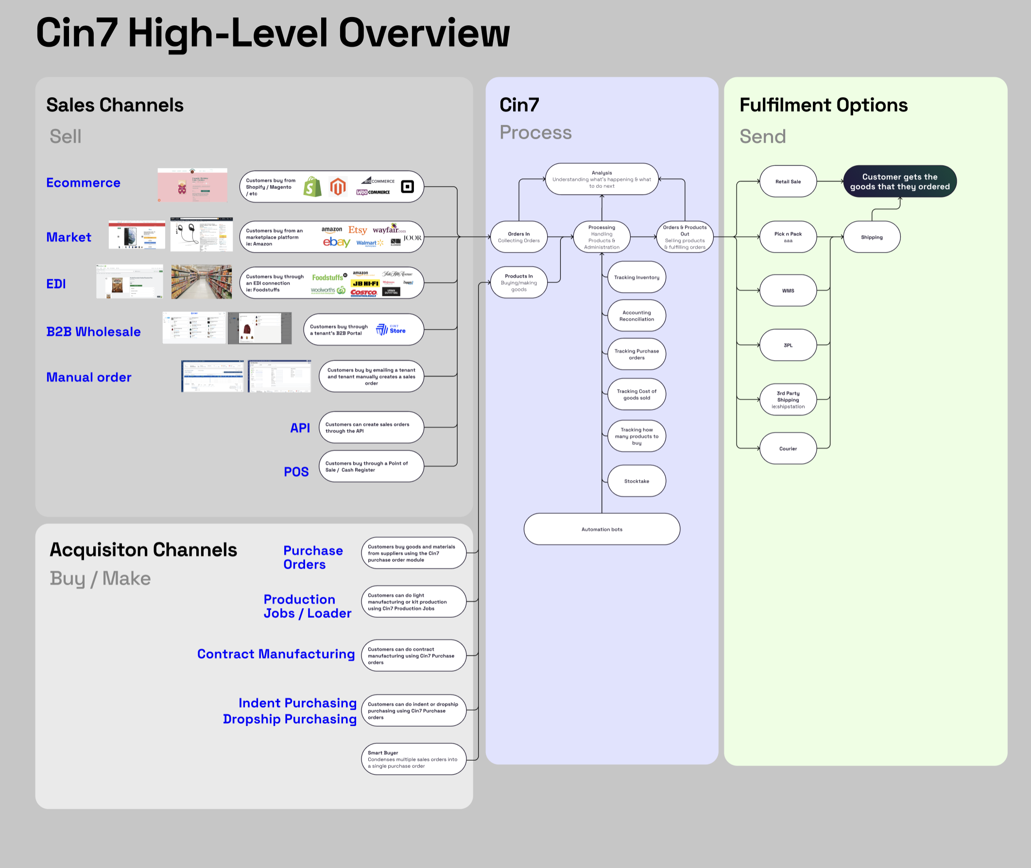
A visualisation showing a high level of key concepts and jobs to be done within the Cin7 platform — you could condense it into four segments: getting products, selling products, reporting on products, and sending products to customers.
Initial discovery
Day one was a little weird. The company didn't know what to do with a designer, let alone how to fully leverage one. This became my personal mission.
To accomplish this, I decided to try and do some design discovery by:
- Listening to staff and customers.
- Observing internal and external processes.
- Reviewing how critical bugs were triaged.
- Learning how new initiatives were prioritised against existing fires.
It seemed like almost all the engineering capacity was devoted to bugs and maintaining existing integrations with zero time for polish. To be fair, I think it was the right call — certain bugs meant that customers lost money, and in severe cases, six figures a day.
Challengingly, it meant that if I wanted anything done, I'd have to get my own hands dirty in the codebase.
At the same time, it rapidly became apparent that Cin7 was a low design maturity organisation. For those that don't understand the concept of design maturity — it means that design as a discipline isn't really leveraged in the product development process to get better results.
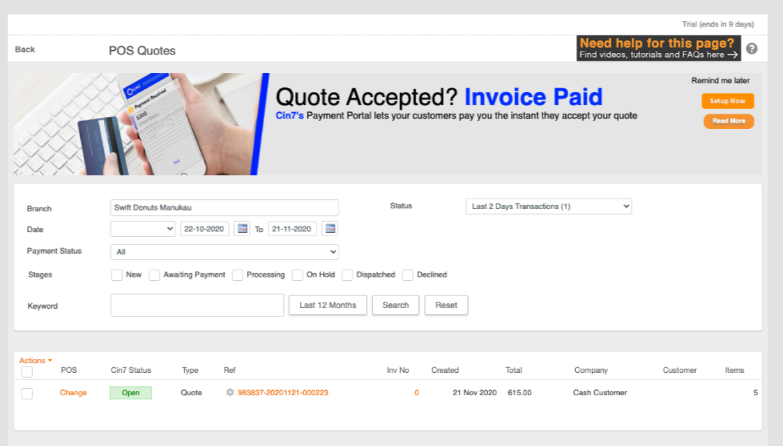
A screenshot of our point of sale webapp in 2020 — product design was kind of an afterthought at the time and it showed. We would even advertise upsells to customers that were already on the highest tier of our product.
A teamfight against 20+ years of tech debt
I jumped into the work headfirst, supported my team on every feature and bugfix I could get my hands on, and discovered a rats nest of problems.
The code was 20+ years old. I'm talking multiple different versions of React/CRA, AngularJS, and ASP.Net codebases smoooshed into a single app. The top navigation component was a separate react app to the current page. Likewise with the sidebar navigation. All of this was wrapped in an ASP.Net application running on an ancient .NET Framework backend.
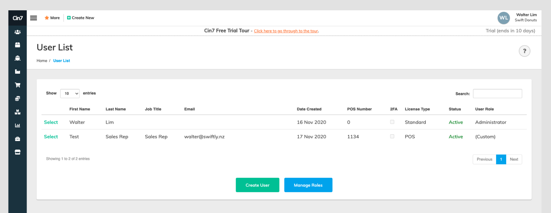
Notice the fragmentation yet? Depending on the developer and product manager working on it, navigation and primary buttons within the app could be any of 50 different implementations.
The application was difficult to design for; a quick look in both the codebase and browser inspector told me that almost every component had 50 different visually-different implementations across the hundreds of pages on the platform. Thats before you get into the fact that every component and page was written as nested <table> elements 20 tables deep with hardcoded explicit dimensions. Even the buttons you see below were nested <table onclick="doStuff()"> elements.
This was exacerbated by the fact that we didnt have any designers before I joined; every product manager was responsible for design on each of the products/module they looked after — this resulted in immense experience fragmentation both in user flows, component libraries and product heuristics. This meant that every module and feature effectively felt like a different product you had to relearn how to use every time you changed page.
I can't publicly provide specifics, but it was detrimental for usability, especially when it came to new user onboarding and the numbers showed it.
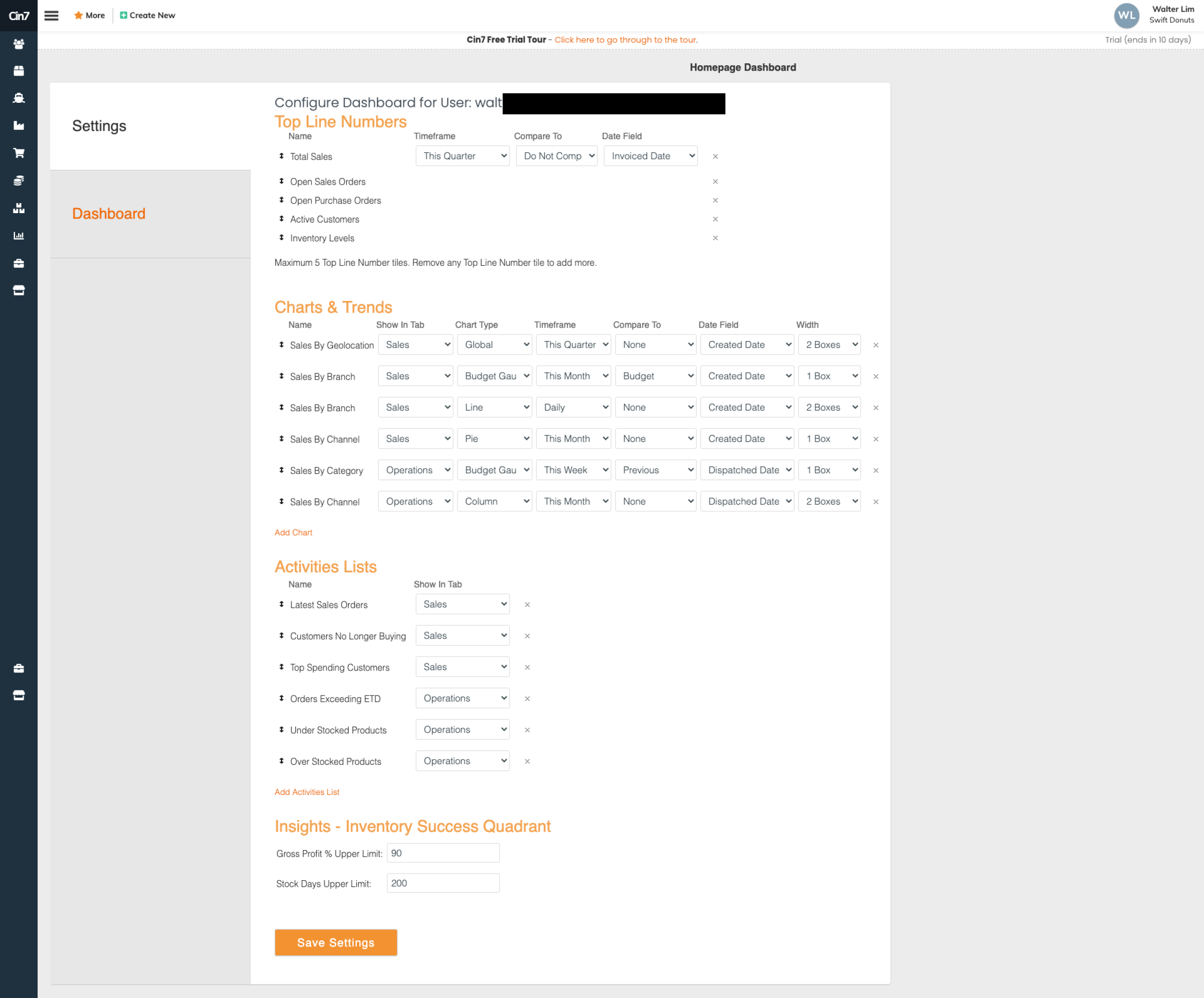
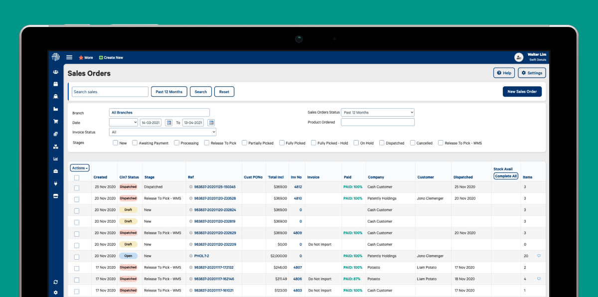
There were hundreds of pages like this, mostly to enable configuration to suit different business needs. This was for a sales dashboard.
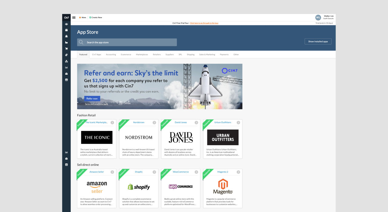
Responding with a technical frontline approach
In response to everything discovered above, the first thing I proposed was a consolidation of components into a single unified library and a partial re-architecture of the front end to simplify the experience. Deliverables in Figma for designers, and Storybook for developers.
This was impossible to tackle piecemeal — four designers before me had tried to do it module by module as conventional wisdom recommended. Every successive attempt failed, resulting in even more experience fragmentation.
To get stakeholder buy in across product, management, and engineering I put together a high level sitemap of the system with figma which you can see below, and then mapped out the current state of the platform.
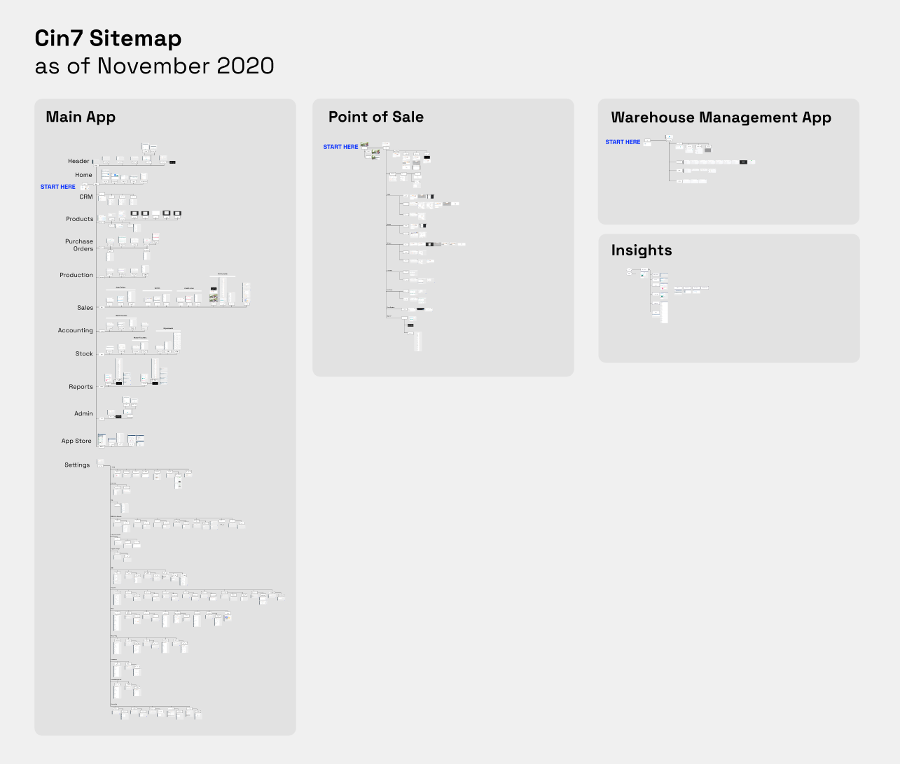
A sitemap I put together when I first started that gives you a rough feel for the size of the system — this doesn't include the hundreds of integrations and other system configuration pages like the one used to connect your business to Amazon Marketplace, or any of our internal tooling.
Prototyping with CSS
I then did some rapid prototyping in our dev environment over a day and a half by using CSS editor chrome extensions.
I would've used Figma, but the product was incredibly data dense and data entry heavy. It was literally faster to build a lot of the interactions in code to get a feel for how the system would work.
Using code also meant that I could do rapid usability testing without spending too much time building out the interactions in figma.
This approach quickly and cheaply proved my hypothesis that we could make easy wins with CSS and basic semantic markup changes, at the cost of minimal additional tech debt. It also meant that we could cycle through iterations in minutes, instead of spending weeks building out text input prototypes in Figma that were incapable of emulating large amounts of data entry.
The prototype was a hit with management, and I was given the go ahead to start working on the frontend rebuild on the codebase as a product designer, which was hosted on Azure DevOps at the time.
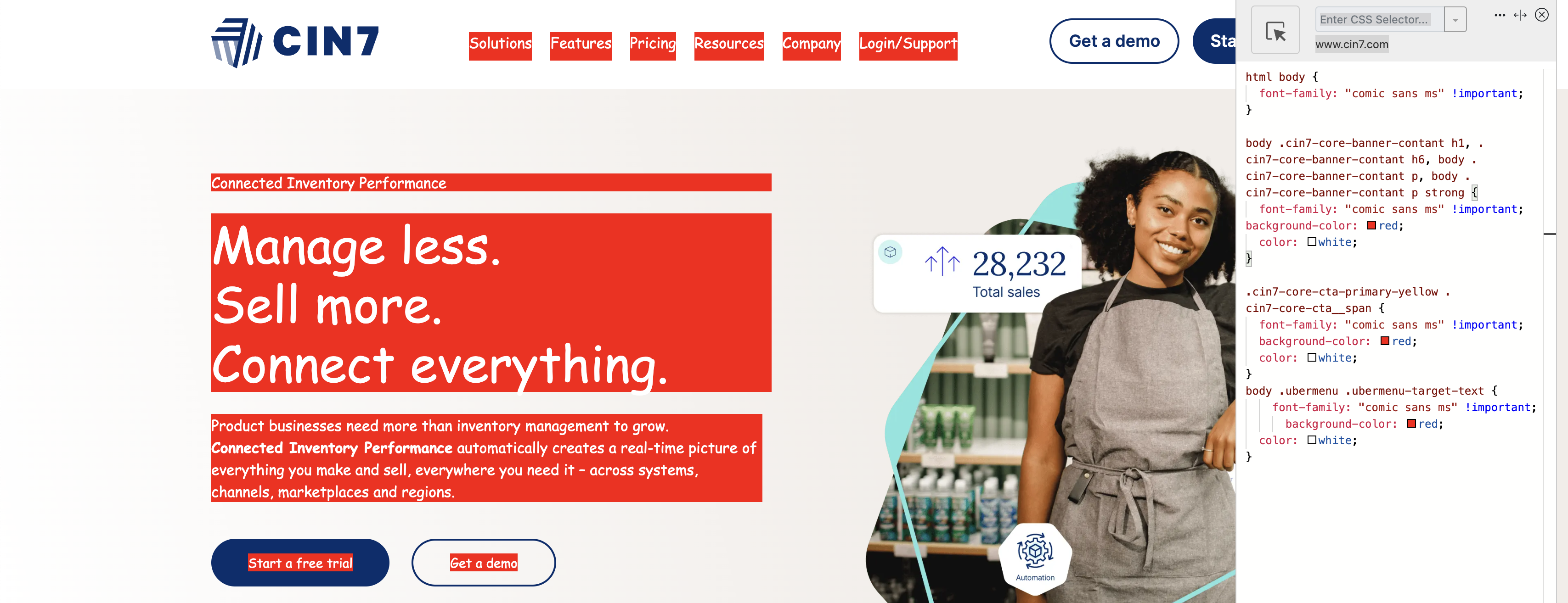
An example of how I rapidly prototyped using CSS editor extensions — a lot of this hinged on knowledge of CSS specificity and how the box model behaved in the DOM.
A lot of the work after this included negotiating with engineering teams and getting mentored on how to write .aspx and .ascx up to an acceptable standard to get the design system into place while touching as little technical debt as possible ie: cutting our losses on difficult edge cases that would've taken months to rebuild.
One particularly egregious example included templated pages that were built in a way that made them impossible to redesign without a complete rebuild. I'm talking about webpages consisting of custom customer-defined HTML/CSS/JS, C# and SQL mashed together that were stored as string literals in the database. Many ungodly technical sins were committed. Some by me, and some by my team to get us to production.
I then set about building out a really basic design system in tandem, which included a Figma component library, a React storybook component library, and a set of design guidelines that would help us standardise the experience across the platform so that the rest of my team could fast follow.
This way, design and dev could be kept tightly in sync.

A snippet from the Donut design system showing how to use components to build functionality
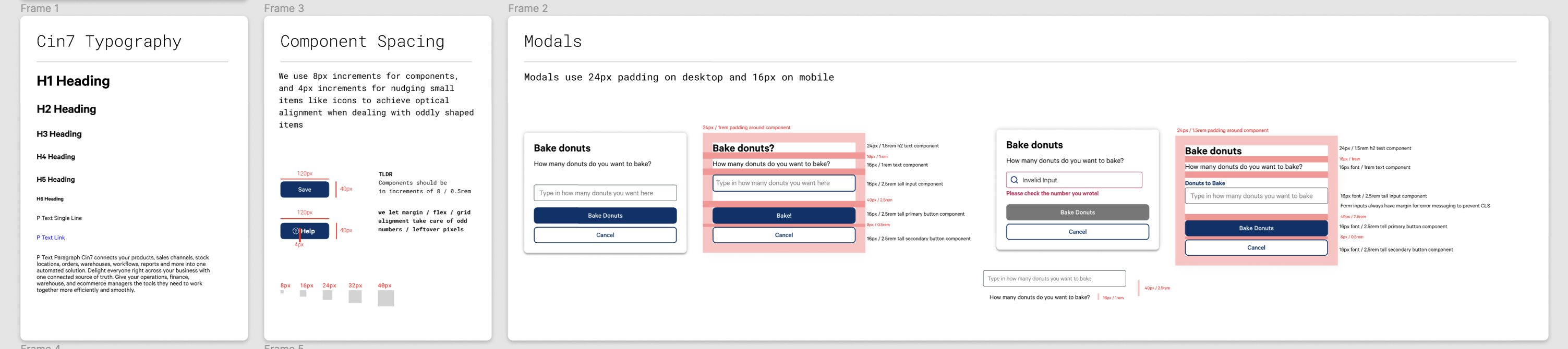
An example of design system guidance — spacing and padding on modals
It took about two weeks to get 80% of the design system into place in a development environment. Maybe about a month after that to get the polish and a lot of responsive behaviors working across pages. overflow-x: scroll was my best friend when it came to many of the complex table components, especially for making dense components responsive.
position: sticky solved a lot of existing problems for support staff who had to constantly tell users to click the save button, and reduced a lot of friction on the platform when I made save buttons persistent on the page for users and staff.
Most of the work also involved improving the developer experience by stripping out outdated components styled with nested <table> elements, float properties, position: absolute; abuse, and redundant overuse of !important.
Turns out, moving to a more modern approach where components are constructed with display: flex; and display: grid; significantly improves the frontend experience for developers and helps the whole team ship faster.

One of the biggest impact wins on support ticket volumes was a single sticky save bar. It ensured users saved their config changes. Turns out when you put a save button at the bottom of a gigantic form, users tend not to click it and blame the system for not saving their work.
Productionising the experience
To get it to production, we undertook a big bang approach to releasing the update. That meant every touchpoint and module on the platform was updated at once when we deployed the design system update in production.
It was a risky move, but it paid off. I had a lot of support from the engineering team, and we were able to get the update out in a week.
It worked.
I can't publicly provide specifics, but loosely after the rebuild..
- Customer NPS spiked upwards Redacted%
- Frontend development velocity increased 3X
- Support ticket volumes were down Redacted% YoY
- Churn was down Redacted% YoY
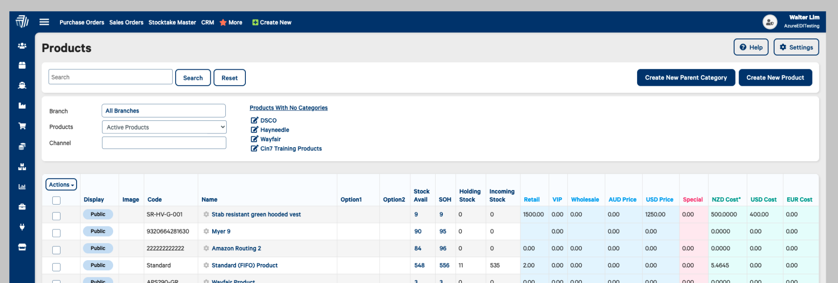
An example of one of the updated pages
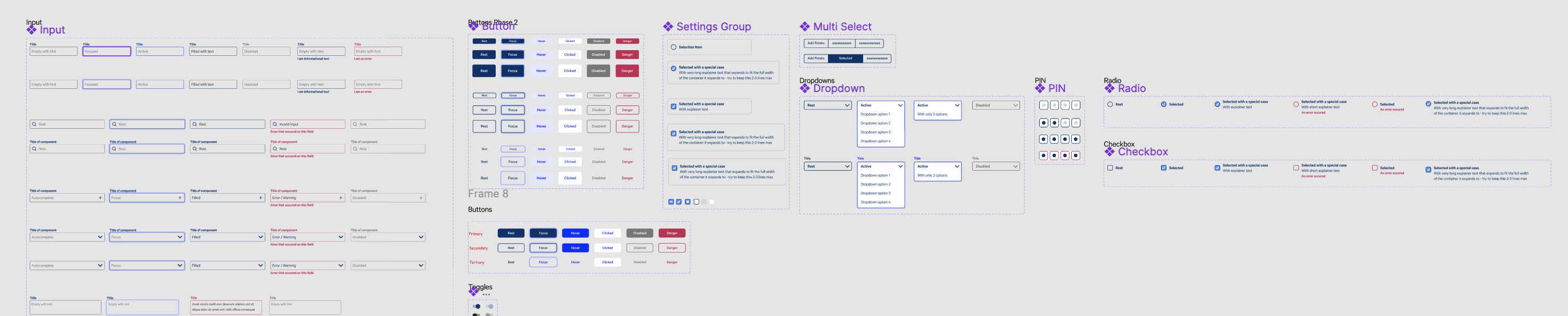
A snippet of the figma component library
Earning design a seat at the table
So after celebrating the successful launch of the system redesign, I got to work documenting all the new system norms.
On the problem validation side of the spectrum — I tried to normalise some parts of design thinking that I found useful. Our product team was mostly involved on the problem validation side — We would collaborate on research, user needs, and functional requirements at this step before deciding on bets.
On the solution validation side of the work: I set up a few design guidelines in the design system: Like rapidly prototyping with as few primary actions on a page as possible, setting consistent spacing between components, and normalising the use of consistent components like buttons, cards, and inputs across the platform.
Overall, we collectively purged the majority of the experience fragmentation that had plagued the platform for years. Once we had some breathing room, I documented most of this in Figma, and then propagated it to storybook — you can see me give a talk about it here at a meetup in 2021.
This work paved the way for further investment into design as a discipline at the company. Design was leveraged across more projects to get more wins, and I was able to scale the design team to 3 people before moving onto the next challenge.
I might write about more projects later on, but the Donut Design System was one the most impactful ones I was about to pull off at Cin7.
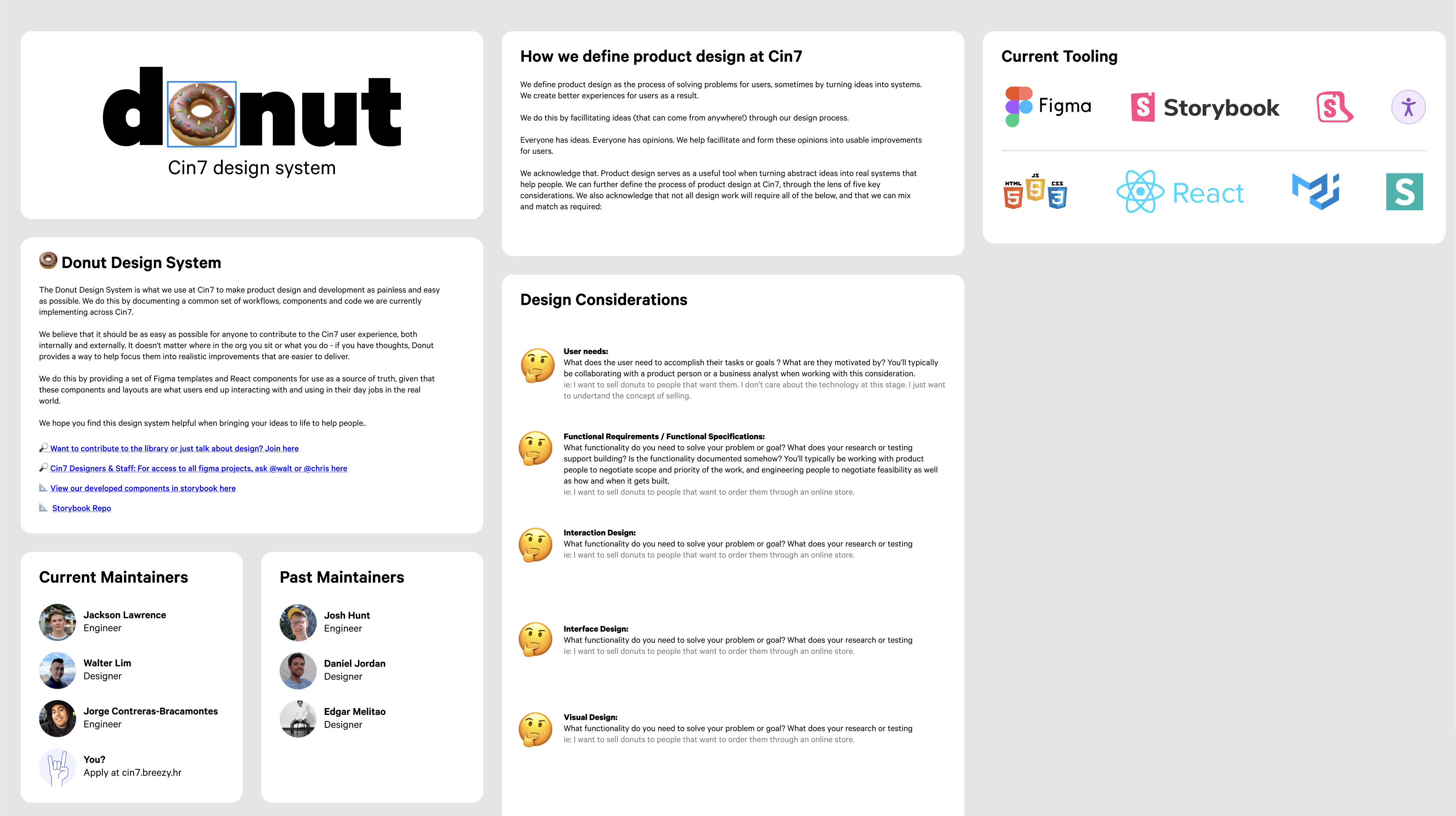
High level design principles were taken from JJGs Elements of UX Design Model — I've found it to work absurdly well.